Agency: Cella
Agency: Cella

Chevron.com serves as the company’s global digital hub, supporting a broad mix of business-critical transactions and communications for stakeholders, investors, job seekers, partners, and the public. Over time, the legacy platform had become fragmented and multiple teams ahd contributed content and features independently, leading to inconsistencies in design patterns, accessibility gaps, and performance issues. The site’s outdated architecture limited its ability to scale, adapt to new business needs, or provide a coherent, user-centred experience. Chevron required a modern, enterprise-grade platform that could reconcile the needs of diverse stakeholders, streamline governance, and enable sustainable growth.
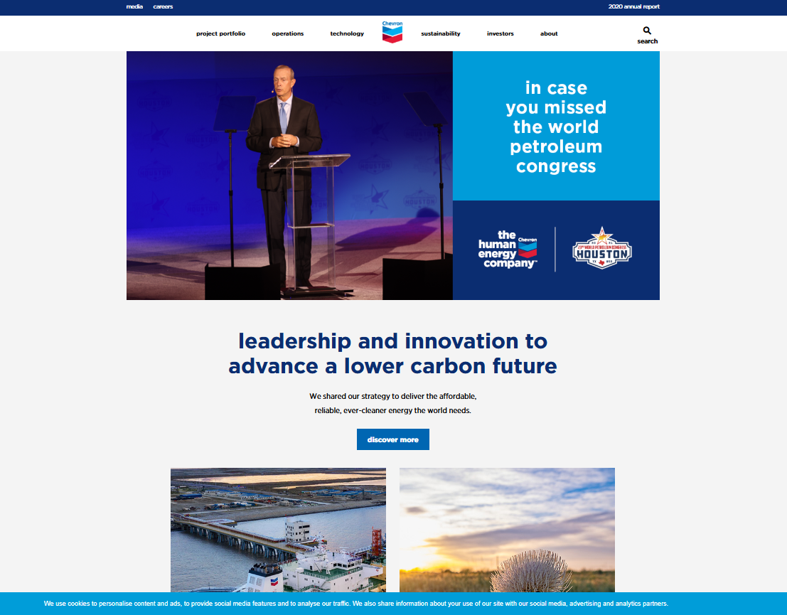
As UX and Creative Director, I led a cross-disciplinary team through the transformation of Chevron’s digital ecosystem. My responsibilities included driving the UX vision, guiding the creation of a scalable design system, and orchestrating alignment across business units, IT, external vendors, and brand teams. This meant balancing enterprise-level requirements with user-centred design principles, ensuring that the new platform supported business-critical functions while remaining intuitive, accessible, and future-ready.
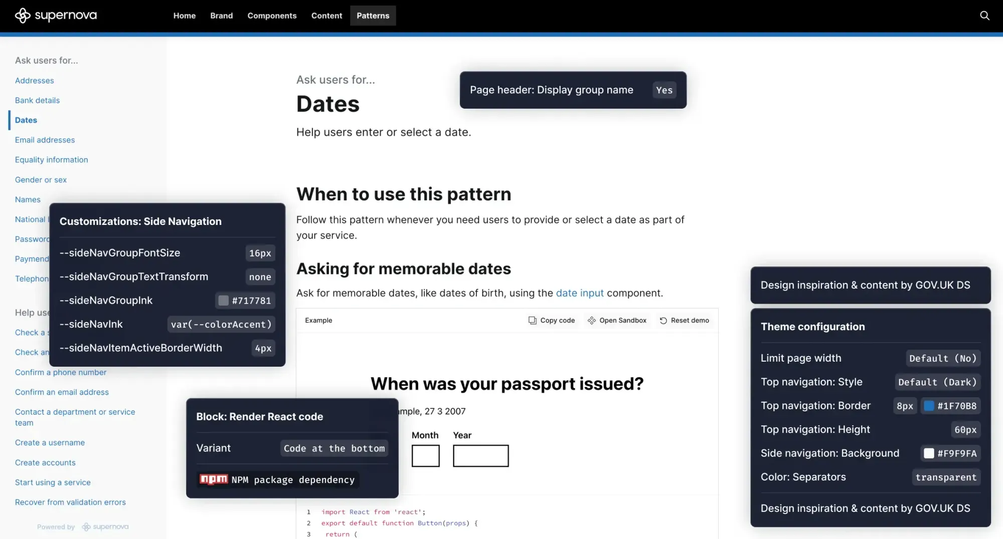
We created a modular, enterprise-grade design system to unify Chevron’s fragmented digital ecosystem. Built with WCAG compliance at its core, the system standardised interaction patterns and visual components across multiple business units, enabling both in-house teams and external vendors to deliver with consistency and speed. This was not just a design toolkit, but a governance model — with usage rules, documentation, and governance councils ensuring long-term adoption across a highly distributed organisation.

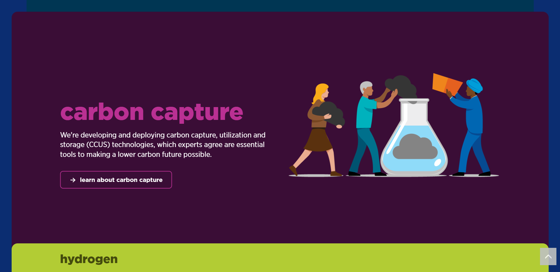
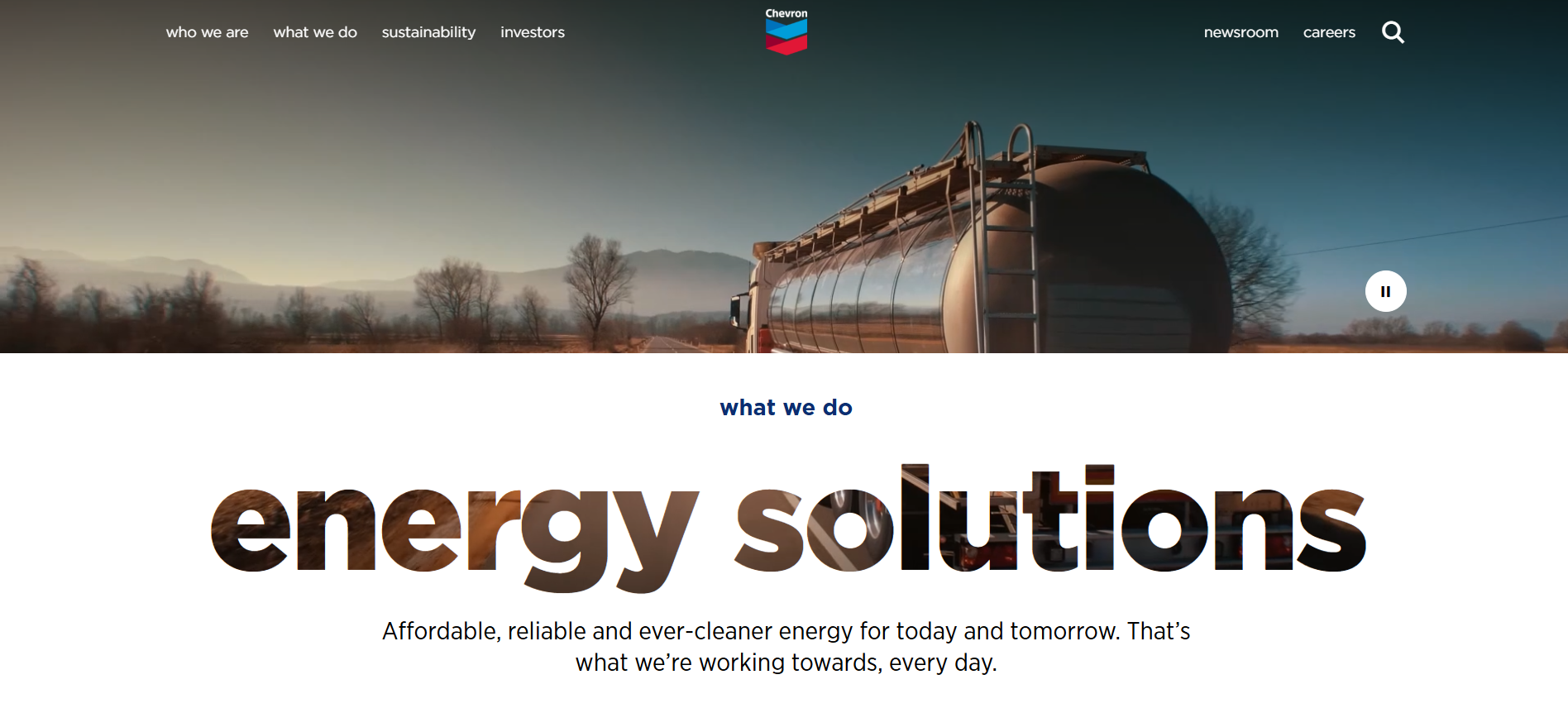
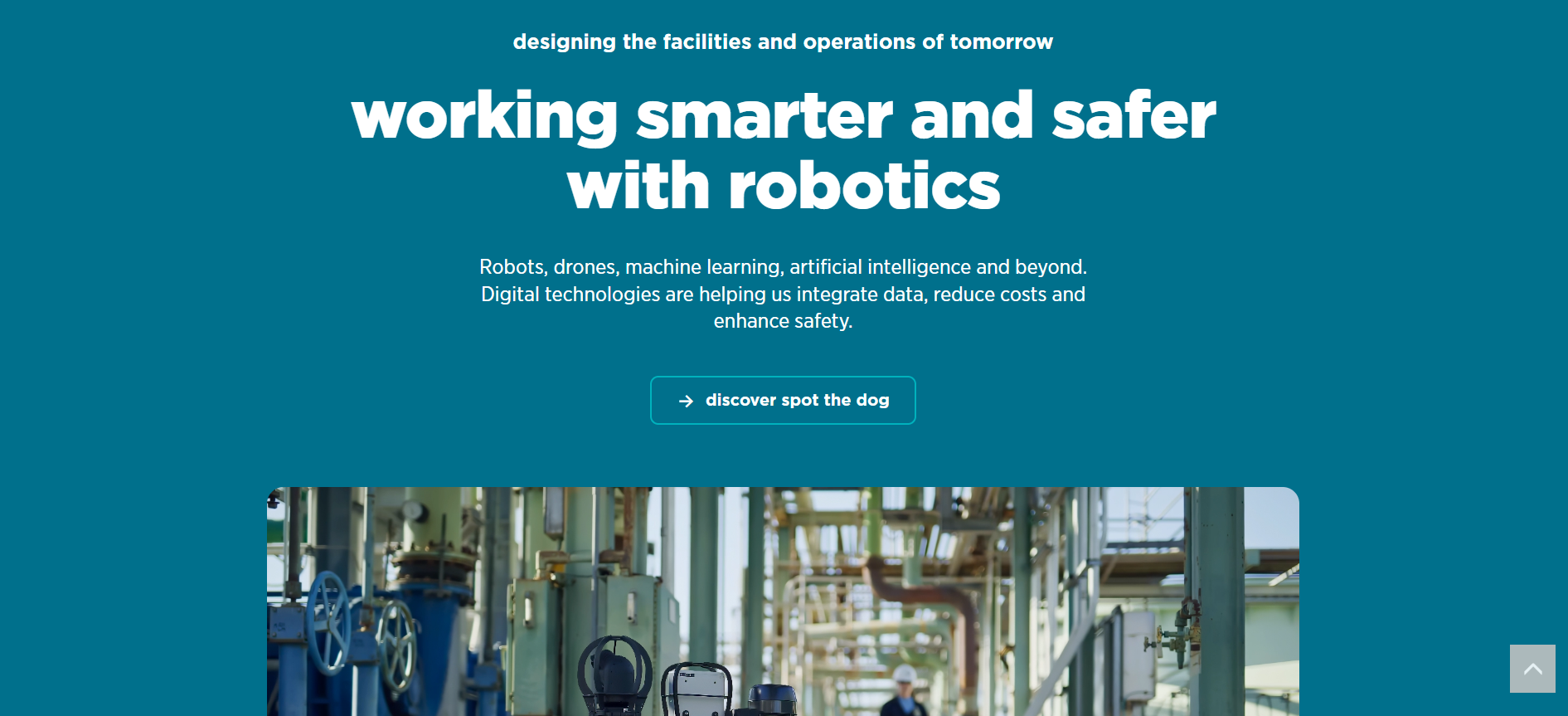
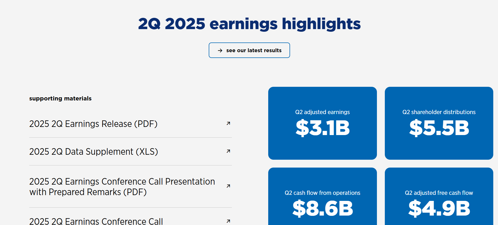
We redesigned high-traffic and business-critical areas such as investor relations, careers, and environmental disclosures. Each area came with competing stakeholder priorities and legacy workflows. My team streamlined these journeys by simplifying information architecture, rationalising navigation, and aligning design with measurable user intent. We balanced compliance and precision with modern digital storytelling to meet both regulatory and user experience needs.
The existing content management and technical infrastructure placed heavy constraints on performance, scalability, and flexibility. I partnered with internal IT teams and internal stakeholders to design solutions that respected these limitations while preparing the platform for future expansion. This required close orchestration between business, technical, and creative groups to ensure a stable yet adaptable outcome. At this stage, I led the design team in the creation of wire frames for each page we inteded to redesign.

From investor pages to career content and environmental disclosures, we evaluated, redesigned, and rebuilt dozens of pages to better align with user intent. I collaborated with strategy and content leads to modernise the site’s IA, simplify navigation, and improve storytelling without sacrificing precision.
Recognising that digital systems only succeed if they’re maintained, I drove the creation of governance frameworks, onboarding processes, and documentation standards. We adopted a 'One Source of Truth' approach that ensured all teams could scale the system independently while maintaining consistency. Adoption was treated as a core deliverable, not an afterthought. Additionally, I worked with leadership to ensure that the documentation would serve as a living document with long-term allocation for monthly updates and reviews from the design team. This helps ensure that the dosumentation will up-to-date and accurate for many years to come.
